Last year, James Martin and I wrote an article for The Testing Planet about low-tech dashboards. Even though James has now left Campaign Monitor and flown to the other side of the world, the power of the internet has enabled us to bring you this nostalgic review of dashboards past.
The basic idea was that we wanted a simple way to convey things like risk, perceived quality and testing progress to the rest of the team. We also hoped to involve them in discussions about these things. So we started drawing these dashboards on the big glass whiteboard in our company’s lunch room.
 |
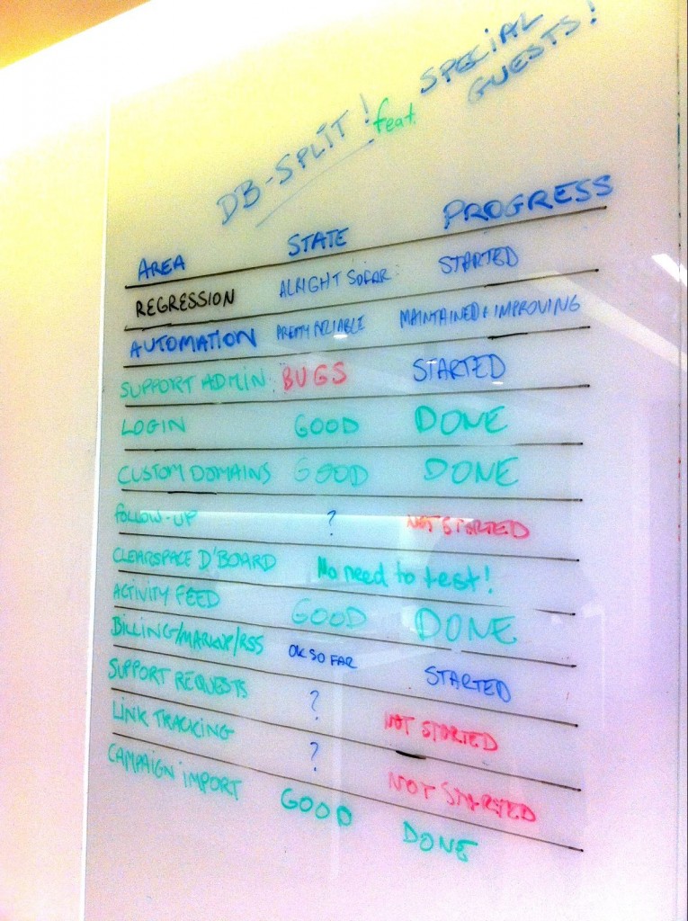
A classic “state/progress” dashboard. I like this one – excellent use of colour. I give it 4 stars. |
| Probably the best compromise between form and function. I think the excellent use of colour was a function of us not having lost the red pen at this point.
I rate it ‘Elephant’. |
 |
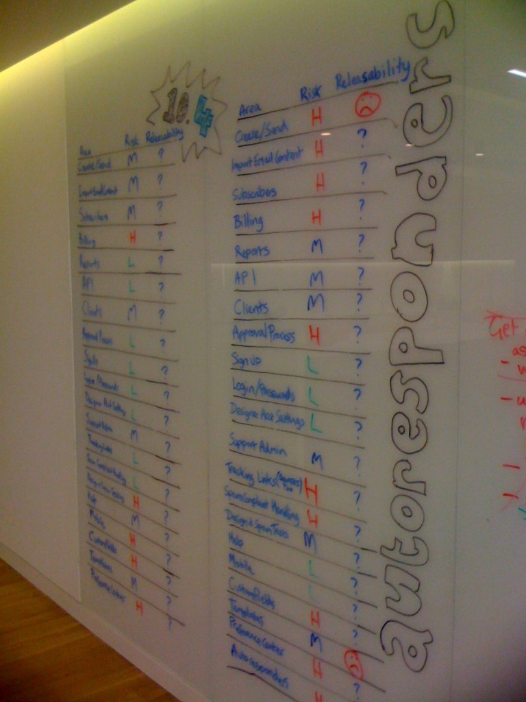
| Releaseability was our attempt at a meaningful adjective that could be used across purposes. Never quite worked as intended.
I rate this ‘Fried Egg’ |
 |
| Totally love this one. Our best work by far.
Also takes the prize for ‘best setting for dashboard defaced by a comedy wang’. I rate this ‘Tiger’. |
 |
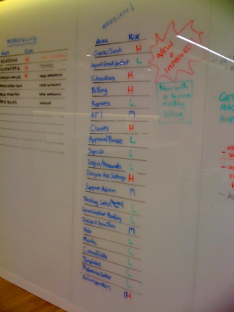
| Pretty full fat. This one really radiates a lot of information without necessarily conveying any extra subtle meaning or sparking a lot of conversation.
I rate this a Fried Egg. |
 |
 |
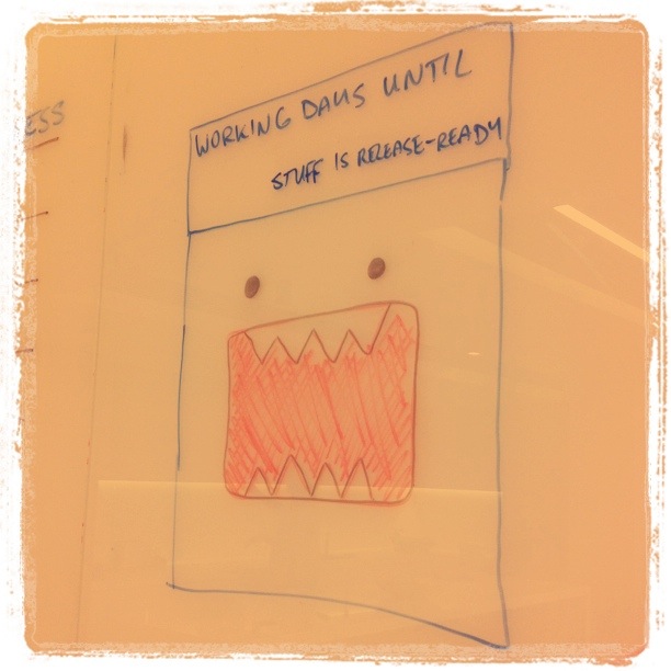
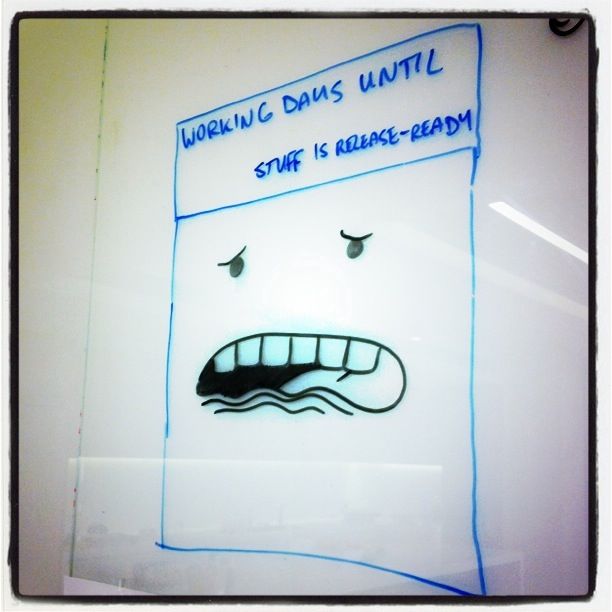
This used to have a number, showing the number of days until stuff was ready for release, but then the number became zero, then negative one, then this. I like the simplicity of it. 4.5 starfruits. |
| Great use of popular culture. I get a real Andy Warhol feel from this dashboard. It speaks to many different aspects of both the development, release process and our mental state. |  |
 |
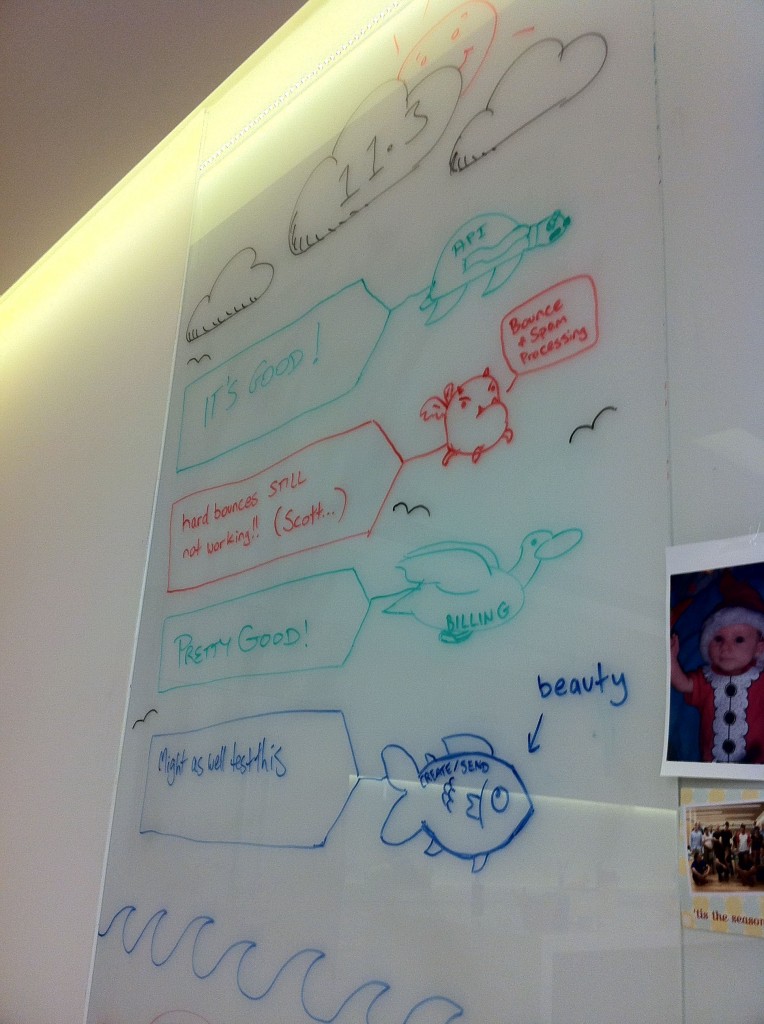
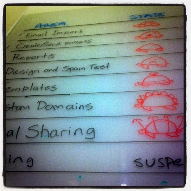
Turtles all the way down! This is definitely one of my favourites. Do you remember what all the turtles meant? This one attracted a lot of discussion. 5.6 stars. |
 |
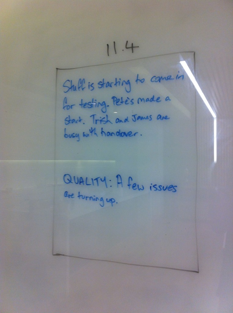
Information in a box. I don’t think it says anything really useful and I don’t think it’s pretty. One star. |
| This was a perfect example of ‘developer friendly’ dashboarding. No nonsense, utilitarian form. I kind of liked the sentiment but would have preferred more flying creatures. |  |
| Agreed. This one was a great juxtaposition of design and test land dashboards. I’d like to see more collaboration in future. |  |
This is just a sample of some of the many different dashboards we made over the last year. Do you have a dashboard you’d like to share? We’d love to see it!


